
How Do You Choose The Right Color Palette For Your Artwork ?
“In this blog, we’ll show you how to choose color palette for artwork that enhances your message”. Color is one of the most powerful tools an artist has. It sets the mood, tells a story, and brings life to your work. Choosing the right color palette for your artwork But with so many shades and combinations to choose from, many artists — especially beginners — often ask:
Choose color palette for artwork.
In this blog, we’ll guide you through the process of selecting a color palette for artwork complements your subject, strengthens your message, and elevates the overall impact of your art.
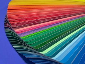
1. Understand the Basics of Color Theory
Before you choose your palette, it helps to understand how colors work together. Here are a few key terms. Using tools like Colors can simplify how you choose color palette for your artwork:
Primary Colors: Red, blue, yellow – the foundation of all other colors.
Secondary Colors: Green, orange, violet – made by mixing primary colors.
Tertiary Colors : Mix of a primary and a secondary (e.g., red-orange, yellow-green).
Complementary Colors: Opposites on the color wheel (e.g., blue and orange). They create contrast.
Analogous Colors: Neighbors on the wheel (e.g., blue, blue-green, green). They create harmony.

2. Consider the Mood and Emotion of Your Artwork
Colors evoke emotions Therefore, ask yourself what you want the viewer to feel when they look at your piece.
- Warm colors (red, orange, yellow) = energy, warmth, excitement
- Cool colors (blue, green, purple) = calm, peace, sadness
- Muted colors = softness, nostalgia
- High-contrast colors = drama, intensity
> Example: If you’re painting a peaceful landscape, a palette of soft blues and greens will enhance the serene feeling.
3. Use a Limited Color Palette for Harmony
Using too many colors can make your artwork feel chaotic. Stick to 3–5 colors and build around them.
Try these types of palettes:
Monochromatic: Variations of one color (light to dark)
Complementary: Two opposite colors (like purple and yellow)
Triadic: Three evenly spaced colors on the wheel (like red, yellow, blue)
Split-Complementary: One base color + two adjacent to its opposite
> 🎯Pro Tip: Limit your palette when you’re starting out. It trains your eye and helps maintain balance in your work.

4. Let Nature and Photography Inspire You
For example, nature offers some of the most beautiful color combinations. Look at:
Sunsets, Forests, Oceans, Flowers, Animals.
You can also use photography websites like Unsplash, Pexels, or Pinterest to explore color-rich references. Use eyedropper tools to pick colors from an image and build a custom palette.
> Nature rarely gets it wrong — use it as your teacher.

5. Try Digital Tools to Create Color Palettes
There are many free tools available to help you find and build palettes:
Coolors.co, Adobe Color, Canva Color Palette Generator
These tools allow you to :
- Generate palettes based on photos.
- Explore popular combinations.
- Save and name your favorite palettes.

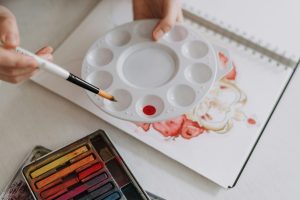
6. Practice Swatching Before You Begin
Before you dive into your final piece, test your colors on a separate sheet:
- See how they look next to each other
- Check how they behave when mixed or layered
- Adjust saturation and tones as needed
> Pro Tip: Keep a color swatch library in your sketchbook for future reference.

7. Trust Your Intuition (And Don’t Be Afraid to Experiment)
As you gain experience, you’ll start to feel what colors work for your style. Don’t be afraid to break rules or try bold combinations. Some of the most iconic artworks stand out because the artist took risks with color. Before you start painting, think about how to choose color palette for artwork that reflect the mood.
> “Color is a power which directly influences the soul.” — Wassily Kandinsky.
Many artists struggle with how to choose the right color palette for artwork that matches their vision. Choosing the right color palette doesn’t have to be overwhelming. With some basic knowledge of color theory, a clear vision for your artwork’s emotion, and a bit of practice, you’ll be able to create palettes that truly elevate your work.
🎨 Start small, experiment often, and trust your creative eye.